MODULE
20 Typography Mistakes Every Beginner Makes


Much more than just arranging pretty fonts on a nice background, typography is an essential part of most designs — one that can make or break a whole project.

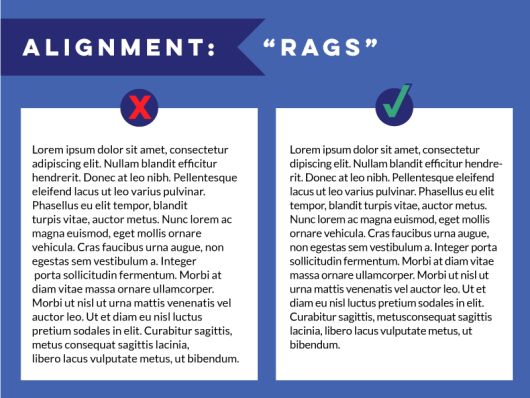
Unfortunately, typography errors tend to make a bigger statement than good typography. Mistakes stick out like a sore thumb, while thoughtful typographic choices blend so nicely with the overall design that you might overlook them. So if you want to get your message across without distracting typographic errors, learn to recognize some of the most common mistakes below, and use this article as a final checklist before wrapping up your design.


  Much more than just arranging pretty fonts on a...
01. Crowding Your Letters: Tracking
It’s a tempting fix: You’re short on space; you need to fit in a certain amount of text; so what do you do? You make the tracking (or letter-spacing) a little bit tighter and call it good. The problem is, when your letters are too close, it decreases readability significantly (especially when working with smaller font sizes) and makes your design look crowded.
01. Crowding Your Letters: Tracking
02. Crowding Your Lines: Leading
This applies to whole lines of text, too. The spacing between lines (called leading) also affects legibility — you don’t want the spacing to be too tight or too loose; both make for hard-to-read text and a visually “off” design.
02. Crowding Your Lines: Leading
03. Not Scaling Proportionally
Another rookie mistake (similar to the previous one) is stretching or condensing words to fit into a certain space. Don’t do this — it distorts the letters, giving them a shape they weren’t meant to have. But there are ways to avoid this problem. One is to make sure that when you’re scaling a text box up or down, you do it proportionally. Different design programs have various shortcuts for doing this. For instance, in Canva, it happens automatically when you drag the corner of a text box or any other object. In Adobe programs like Photoshop and Illustrator, you hold down the Shift key as you drag the corner of your text box. Other workarounds include adjusting the font size and/or tracking to fill a space more effectively.
03. Not Scaling Proportionally
04. Ignoring Readability
If you want your design to attract attention, people are going to have to be able to read it clearly. But sometimes it’s easy to get so caught up in the design process that you make choices that achieve a certain look, but aren’t very practical. For example, thin, white text on a black background might look sleek, but can be hard to read. Legibility issues can come in many forms — a font could be too small; the font and background colors might clash; or transparency effects might make text hard to see.
04. Ignoring Readability
05. Ignoring Readability, Part 2: Body Copy
Long passages of text (also known as body copy) need special consideration in terms of readability. Rather than attract attention, this kind of text just needs to be clear and easy to read. Part of that will be arranging the text in a way that makes it easy for the eye to navigate, considering things like font size, tracking, leading, etc. Traditionally, serif fonts are used for body copy, because it’s thought that the serifs help the eye move along more quickly. But simple, sans-serif typefaces can work just as well (and are common for web-based reading).
05. Ignoring Readability, Part 2: Body Copy
06. Not Taking Care of “Orphans” and “Widows”
Speaking of body copy, one of the easy-to-overlook errors that can happen when working with paragraphs of text is something called “orphans” and “widows.” The terms are sometimes used interchangeably or reversed (which can get confusing), but they’re basically just typographical lingo to refer to words or short lines that appear by themselves at the top or bottom of a column or page of text, separated from the rest of the copy. When you’re typesetting a text-heavy project and you notice one of these dangling somewhere, you want to fix it to avoid creating large patches of white space that interrupt your text. It’s an easy fix: just manually change where the line breaks, or adjust line length or tracking slightly.
06. Not Taking Care of “Orphans” and “Widows”
07. Double-Spacing After Each Sentence
One more copy-related tip: don’t double-space between sentences. Even though many of us grew up learning to type placing two spaces after a period/full-stop, that practice is now considered outdated and unnecessary. Plus, double-spacing creates visual breaks in a block of text that interrupt readers’ flow. If you find that old habits die hard, many programs have tools to locate and replace double-spaces with singles (like Microsoft Word’s “Find and Replace” or InDesign’s “Find/Change” function).
07. Double-Spacing After Each Sentence
08. Using Too Many Typefaces
Some designs call for a decorative mix of typefaces, but most won’t. The majority of design projects benefit from a limited number of fonts — two or three is a good rule of thumb. Too many types and styles of fonts can make your design look amateurish and thrown together, rather than professional and well thought out. Sticking to a more conservative approach to typography keeps your design looking clean and organized instead of cluttered and chaotic.
08. Using Too Many Typefaces
09. Mismatching Fonts
Besides avoiding using too many typefaces, part of making good typography choices is picking fonts that harmonize well. Because when fonts clash, it’s distracting and takes away from your content, potentially preventing your message from getting across. Combining fonts is somewhere between a science and an art — part learning typography basics, part practice, part personal preference, part intuition. Choosing one serif font and one sans-serif font is a good starting point, but making a point of noticing how fonts harmonize well (or not) in real-life contexts (websites, magazines, product packaging, etc.) will help you develop a sense of how to pair fonts effectively.
09. Mismatching Fonts
10. Not Considering Content
The next step after pairing fonts that work well together is making sure the style of those fonts match the content of your project. Fonts can have different “moods” — playful, serious, elegant, casual, modern, vintage. But when those moods don’t support the purpose of your design, you create a visual disconnect, and it’s confusing for your viewers. This is more of an exercise in common sense than anything: a business report will probably need a conservative, neutral font, but a children’s book cover might have a fun, cheerful font. Typefaces like this, ones with strong “personalities,” are often referred to as display fonts. You should use these sparingly and for a specific purpose.
10. Not Considering Content
11. Focusing on Form Over Function
It can be tempting to follow all the latest typography trends or focus on finding a cool or unique font for your design. But while typography can be very artistic, it also needs to be functional. If you’re prone to getting caught up in the look of typography to the extent that you forget to determine if it actually is readable and works for the purposes of your project, then you’ll need to be extra conscious of striking a good balance between form and function.
11. Focusing on Form Over Function
12. Overdoing the Emphasis
There will be times when you want to emphasize a certain portion of text — to make it stand out visually, to show it’s important, to mimic speaking patterns. There’s lots of ways you can do it, too: italics, boldness, underlining, caps, font size. Just don’t use them all in one passage of text; it looks like you’re trying too hard to get your message across and feels messy rather than meaningful. The occasion should be rare that you even need more than one.
12. Overdoing the Emphasis
13. Using ALL CAPS
One form of emphasis deserves its own section: capital letters. Writing in all caps is all over the place, especially in conversational settings like social media. If you feel you must use this technique, please do it purposefully (like for headlines) and sparingly, because using it for any length of text makes for difficult reading, and in casual usage, capital letters come across as YELLING! (Even if it’s not meant that way.)
13. Using ALL CAPS
14. Neglecting Hierarchy
In typography, hierarchy is just a fancy word for differentiating between different textual elements to show their order and importance. An easy way to think of this concept is picturing the headline, sub-headline, and body copy of a newspaper article. The headline is usually largest, and perhaps bold or in all capital letters, because that’s what you should read first. The sub-headline is a little smaller, and might be in italics or in a different font, and the body copy is usually set in a significantly smaller font size. This type of arrangement lets readers, at a glance, see the various news stories as organized units with parts that make a whole. When you fail to establish a hierarchy for the typography in your design, it becomes confusing; viewers don’t know where to look first or where to start reading.
14. Neglecting Hierarchy
15. Getting Sloppy with Alignment
Consistency is one of the most important considerations when aligning text; just take a little time to make sure all your text is arranged in an orderly, logical way. You don’t want some paragraphs left-aligned, some center, and some right. And you should generally avoid justified alignment altogether. Because, although those straight edges do look nice, it’s what’s in between that causes problems. Justified alignment almost always creates irregular spacing and random chunks of white space that look sloppy and make reading difficult.
15. Getting Sloppy with Alignment
16. Turning Off Margins and Guides
One of the easiest ways to make sure your alignment is on point is to turn on the margins and guides in whatever design program you’re using. While this step won’t fix every alignment problem, it will give you a solid start for laying out your design in an organized way. Many programs also have special alignment tools that do most of the hard work for you — for instance, selecting multiple objects and aligning them to a certain point on the page, or lining up the left edges of a text box and a photo, etc.
16. Turning Off Margins and Guides
17. Not Fixing Ragged Edges
Even if you’re careful with your alignment, sometimes you might end up with paragraphs that have ragged edges, or “rags.” Rags are visually distracting and prevent your blocks of text from having a uniform appearance. The best way to fix them is just going through and changing where the lines break manually. It takes a little extra time, but it’s worth it to give your text relatively straight edges and a clean appearance overall. With this technique, you can get pretty close to mimicking the nice, crisp edges of justified alignment while avoiding its spacing issues.
17. Not Fixing Ragged Edges
18. Adding Special Effects
It’s generally a good idea to avoid using “special effects” on your text, like the kind you’ll find in Microsoft Word’s “WordArt” tool. Examples might include things like 3D or embossed effects, drop shadows, gradients, or warping. Not that there aren’t appropriate contexts for special text effects, but generally, these types of modifications tend to look cheap and gimmicky.
18. Adding Special Effects
19. Not Separating Work From Play
Working on an important project that will be reviewed by a boss or client probably isn’t the best time to test drive a fun new font or try out a funky text effect. By all means, experiment with different resources and design approaches in your spare time, but don’t risk an actual project on questionable typography choices that will appeal to only a narrow audience (unless of course, you’re designing for a very specific audience). A good rule of thumb: If you have to ask, it’s probably not working. Trust your intuition (or if that approach has failed you before, ask a trusted third party) and stick with more conservative typography for serious projects.
19. Not Separating Work From Play
20. Forgetting a Final Check
This is more a practical consideration than strictly design-related, but an important one nonetheless. Doing a final read-through of your text, checking for spelling and grammar errors (as well as any typographical mistakes) should always be a part of your design process. Unfortunately, even unintentional errors can make your project look unprofessional and possibly give your audience a negative perception of your message or company.
20. Forgetting a Final Check
Next: Typography rules and terms that every designer must know