When combining typefaces, there are a couple of important principles you’ll need to keep in mind, namely contrast and mood. Effectively combining typefaces is a skill best learned through practice, and trial-and-error. Once you’ve mastered the principles covered here, you’ll have the tools you need to try out combinations while making educated guesses about what will and won’t work together.
Here, we’re mostly covering combining two typefaces, as you would for body copy and headlines. In the next part, we’ll cover combining more than two typefaces for things like navigation, image captions, and more.
The weight of a typeface plays a huge role in its appearance. We often think of weight in terms of “light”, “regular”, “medium”, “bold”, etc. But different typefaces have varying weights to begin with. Combining typefaces based largely on weight is a fairly straight-forward way of creating typographic contrast.
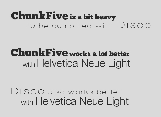
You’ll want to look for typefaces that have noticeable difference in weight, without being too extreme. Very extreme differences in weight need to be made up for with similarities in other respects, particularly structure and style.
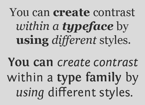
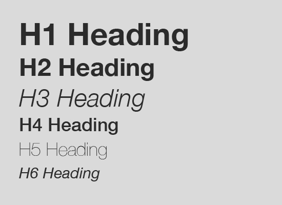
The style of a typeface has a huge impact on how it’s received. Generally, when working with styles, you’re going to be either using regular or italic styles. Underlines are also used, but in web design, they should only be used for links (otherwise, they’re confusing). Other decorations include things like outlines or drop shadows, both of which can be used to unify varying typefaces.
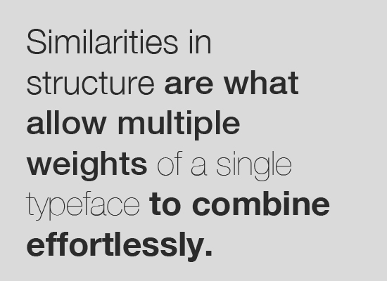
Style and decoration can also be used to create contrast within a type family or typeface. Combine regular and italic fonts, varying weights, and things like shadows or outlines to create variation within a font family and sufficient typographic contrast.
The scale of typefaces, or their size relative to one another, is another important factor in combining typefaces. The hierarchy of different elements within the design is greatly influenced by the scale of the typefaces used. For example, your headings should obviously be larger than your paragraph copy. To the same end, your H1 headings should be larger than your H2 headings, and so forth.
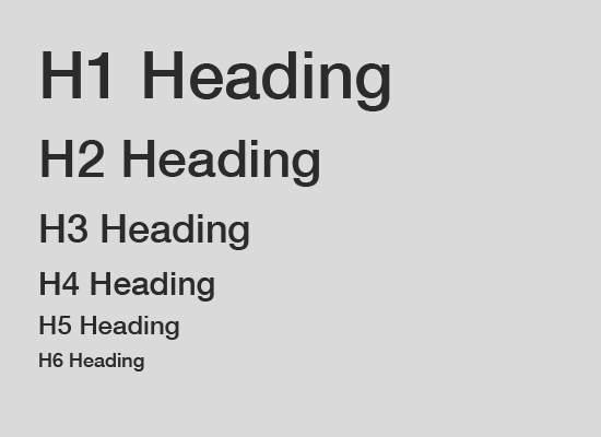
As a general rule, your hierarchy should start with your H1 heading being the largest, and your meta information or captions should be the smallest. You need to balance the differences in scale with differences in weight and style, too, so that you don’t have too much variation in size between your largest and smallest fonts.
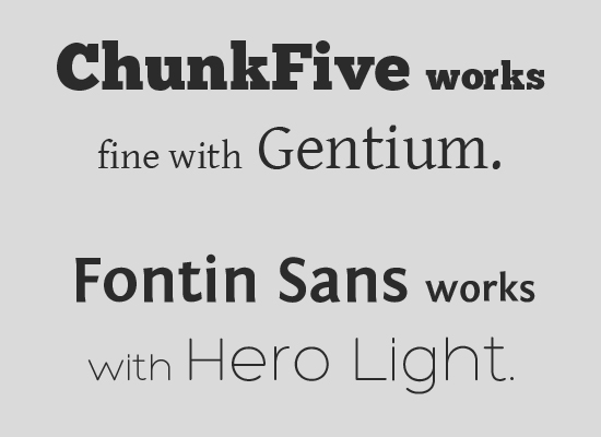
In general, when combining typefaces, you’ll want to choose ones that aren’t from the same classification. Combine a serif and a sans-serif, or a serif and a script, etc., and you’ll have a much easier time coming up with a combination that has proper contrast and doesn’t clash.
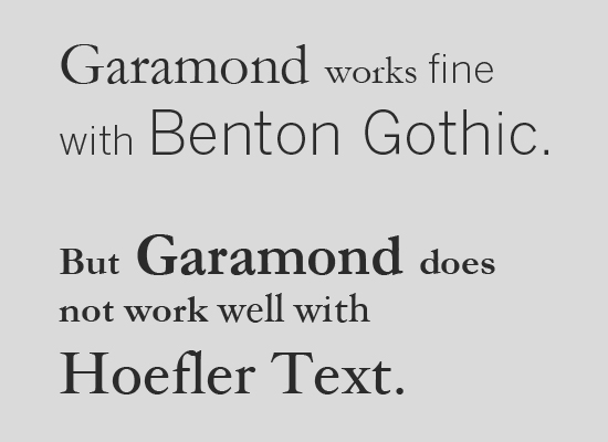
Combining typefaces within the same classification is sometimes possible, but there are some extra considerations. For one, you want to find typefaces that are different enough that they’re immediately recognizable as different typefaces, while also using typefaces that have similar moods, structures, and other factors that tie them together. To some extent, trial and error is your best bet for finding typefaces within the same classification that can work together.
One trick is to choose typefaces that are in the same general classification, but fall under different sub-classes (such as a slab serif and a modern serif, or a geometric sans serif with a grotesk). This provides more contrast right from the start.
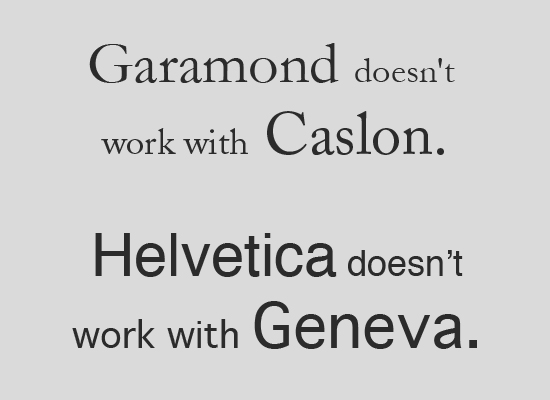
The structure of a typeface plays a huge role in how it works with other typefaces. You either need to choose typefaces that have very, very similar structures, or very different structures. Letterforms that are only a bit similar are going to clash. Typefaces that are very different in other ways can be unified by their similar structures, though the reverse rarely works as well.
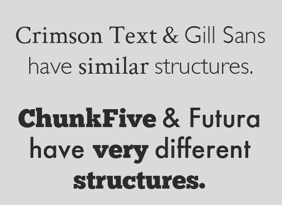
Look at the letterforms side-by-side and see if they share a similar shape or other factor (such as x-height). It’s better to go with wildly different structures than structure that’s almost the same but not quite.
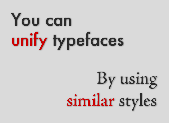
When you need to add visual contrast or unify disparate typefaces, the use of color and texture can do wonders. For example, when you need to add contrast among typefaces that are nearly identical (or within a single type family), changing the color of some elements instantly adds interest. Adding texture has the same effect.
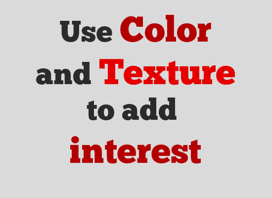
Alternatively, if you have wildly different typefaces, color and texture and unify those typefaces, creating a harmonious look. The principles of color theory still apply to typography, so be sure you don’t go overboard combining colors.
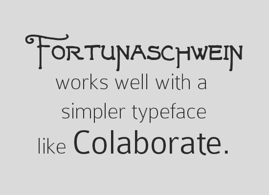
Extreme contrast can be a great option if you’re working with display or script typefaces. In these instances, it can be difficult to find typefaces with good contrast that aren’t too dissimilar. So rather than trying to do that, go for completely different typefaces. Try combining a rather simple typeface with something more elaborate for the best results, rather than two elaborate typefaces.